Monday, December 15, 2008

Approach: Are we there yet?


The approach to any building is quite crucial to its overall design, and the restaurant is no exception. Patrons must feel welcomed and comfortable when approaching a restaurant.

Based on research at Paradise Bakery, Training Table, we have found that the location and design of the approach to a restaurant is one of the most important elements of its design. The more successful entrances have a clearly defined path toward the entrance, and gather visitors to the restaurant quite well. Landscaping and foliage also add the overall success of the approach to the restaurant. At Paradise Bakery, the approach to the restaurant is not very well defined, and it definitely effects the overall experience of visiting the bakery. The front door can barely be seen from the street, but it is not obvious. There is no pathway leading to the entrance door, only a large parking lot in an expansive strip mall faces Paradise Bakery. There is a small sidewalk, in front of the door, but no unique pathway or direction to enter the restaurant. The Training Table, conversely, has a well defined entrance path, laden with an abundance of landscaping and foliage. Patrons of the restaurant definitely feel welcomed into the space, and it is a comfortable approach to the restaurant. Based purely on the approach to the restaurant, visiting the Training Table is much more comfortable and enjoyable compared to approaching the Paradise Bakery.

Therefore:

All restaurants should devote significant attention to the development of the approach to their establishment. The welcoming nature of a well designed restaurant approach is a very powerful design element that should not be overlooked.

Entrance: Come on in?


The entrance of a restaurant is ones first experience with the place. It is obviously an important element of a restaurants design, but how elaborate or thought out does this space really need to be?

The entrances to Chili’s and Training Table are very different than that of Paradise Bakery. Although all three restaurants have an abundance of windows on the same wall as the entrance, the interior of Chili’s and Training Table is hidden from the street. One would need to really come close to the buildings to be able to see inside. At Paradise Bakery, however, the entrance wall is made mostly of glass, and the whole interior space is quite visible before entering the building. Based on observing behavior of restaurant patrons, each type of entrance seemed to promote a different type of activity. The entrances at Training Table and Chili’s invited the customer into the space, and encouraged a relatively lengthy visit. The open and undistinguished entrance of Paradise Bakery promoted quick “in and out” visits. All three restaurants had two large doors for their entrance – pretty much a standard for that type of commercial space. Overall, the entrances to each of the restaurants was successful, and promoted a theme and use of the building that was appropriate for each space.

Therefore:

Successful restaurant entrance design does not need to be elaborate or grandiose. Depending on the intended use of the restaurant, a simple glass or wooden door is sometimes the most successful design for a restaurant entrance.

Where to wait?: before you eat


No restaurant patron likes to wait to be seated, but when a restaurant is too crowded, it is necessary to have a comfortable and convenient place for customers to wait.

Neither the Paradise Bakery nor the Training Table restaurants have a clear, distinguished waiting area. Based on observation and interviews, most of Paradise Bakery’s customers are making a quick stop at the restaurant, and leave the space after ordering a quick “take-out” item. Many people also said that they would not mind taking their food out of the restaurant, and eating it “on-the-go” if all of the tables and chairs were taken. The Training Table, quite conversely, does not accommodate “take-out” orders, and it would be very inconvenient to eat their food without a place to sit. There was no waiting area, however, and patrons who visited the restaurant when full would be forced to go elsewhere. During our study of the restaurant, the dining area was quite empty (only about five or six tables were occupied) so there was no problem with waiting. If the restaurant ever fills up, however, the Training Table would undoubtedly suffer a loss of business.

Therefore:

If there is any chance of a restaurant becoming overcrowded, a comfortable and convenient waiting area is absolutely necessary to keep all possible customers. The design of the waiting area should also be located and arranged to not interfere with people entering or exiting the restaurant.

Table desing: Seating while eating

The layout of the interior seating and table arrangement affects the overall ambiance of a restaurant space, and must be done in a way that is inviting to people.

The interior of a restaurant posses a variety of issues to the success of it's language. One of these main issues is the seating in the building. Looking around at what kind of seating is lay out is before you can totally transform the entire atmosphere and language that is created in the design. Each nook and cranny can be manipulated to create the overall feel of the seating.
Is it a cozy little place that tables are far apart and secluded or are they close together so that walking between them can be a challenge? Do you have an option of things like a bar stool at a counter or a booth or a table?

Based on our research there is usually some kind of mixture of seating types in these kinds of chain restaurants. All three had tables available, Paradise and Chili’s both had booths, and additionally Chili’s had a bar. It seemed as though the real importance varied not so much on the actual type of seating but it's interaction with the space and any other kind of seating or movement intended in the space. In Chili’s people were supposed to stay seated and have very little interaction with the rest of the space the tables were arranged more individually and although they were close, seemed more personal. In Paradise and Training Table the patron moved through more of the space and the arrangements sometimes seemed cluttered when trying to find your own place to sit that was very much connected to the rest of the restaurant.

Therefore:

In order to create the most welcoming environment, more separated tables are needed. To grab a quick bite to eat it might not be so bad with having the close arrangement, but if trying to have a meal with family or friends and enjoy the atmosphere of the restaurant, it is necessary to:
1. Allow adequate space and arrangement so that when people are seated those around them may move easily through the area.
2. Have things split like bar stools and booths in an orderly thought-out way.
3. Allow for patrons to feel an invitation to stay or to leave leisurely (don't leave them exposed and uncomfortable).

Decor: less is more?


How important is the décor of a restaurant? Is an elaborately decorated restaurant more successful than a restaurant that is not decorated?

In all three of the restaurants we studied (Chili’s, Paradise Bakery, and Training Table) there was some form of decoration throughout the restaurant. Chili’s and Training Table had more elaboration decorations, with multiple framed pictures and memorabilia hanging on the walls. Paradise Bakery had an obvious theme to its décor, but the walls were not as crowded with art, and the decorations were much simpler than those seen at the other restaurants. All of the walls in Paradise Bakery were painted in softer earth tones, and it was very clear that the designer intended the restaurant to be a relaxing environment. The simple nature of the décor in Paradise Bakery was very successful at lending patrons to feel calmer and more relaxed. The elaboration decorations at Chili’s and Training Table added to the overall excitement in the restaurants, and this more decorated approach was also successful at these restaurants

Therefore:

The level of decoration in a restaurant does not directly determine whether or not the restaurant will be successful. It is very important, however, for a restaurant to have some form of decoration so customers don’t feel as if they’re in a boring or empty space.

Bigger better?: Size of restaurant


In relation to human scale, are smaller sized restaurants more comfortable for patrons, or are larger restaurants that can accommodate more customers more successful businesses?

Chili’s and Training Table are both housed in their own building and both restaurants are fairly large in size. Paradise Bakery is part of a larger strip mall, and is smaller than the other two restaurants we studied. Interestingly, all three restaurants had about the same amount of tables and chairs, and all three could accommodate about the same number of customers. The seating area in Paradise Bakery was much more crowded, with each of the tables sitting very close to another. Chili’s and Training Table had mostly booth seating, and the overall size and layout of the space were much more predetermined. Based on observing traces in all three of the restaurants, the tables and chairs in Paradise Bakery were moved around much more than in the other two restaurants. This maneuverability allowed patrons of the Bakery to customize their seating arrangement, and made the relatively small space feel a lot larger.

Therefore:

The overall size of a restaurant does not determine how successful it will be. Smaller restaurants, however, would probably not be as successful with a fixed seating arrangement, and larger restaurants would become too chaotic if there was not some predetermined order to its interior spatial arrangement.

Location, Location, Location!


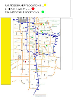
Primarily important to a restaurant chain's success is its location within a city. After all, a chain cannot claim to be more than just one flagship store without multiple locations. The three restaurants we looked at all fulfilled this requirement, however it is the strategic placement of their locations which makes things important.

Starting off with Chilis, that has 16 locations within Utah, their placement is obviously key to their success. In looking at their Salt Lake specific locations, we saw that the placement was adjacent to main through ways or shopping centers. The specific location we visited (off of 400 south on 700 east), is primarily located across from a trax line as well as a main shopping area. This location is central to many other restaurants located in the area, and is easily accessible from other businesses. Paradise bakery shares a parking lot with this Chilis location and thus is also centrally located within the city, as many of the other Paradise stores seem to be. However, the placement of Paradise can sometimes be a little bit awkward or hidden, as it is set back from the street behind the parking lot and can sometimes be missed by passers by on the street. I think some kind of large sign on the street (that lights up), would be helpful to Paradise as it would alert visitors to the location of the restaurant. Chilis does not need a sign as there is already one placed and glowing right out front of the restaurant, however access to the parking lot can be tricky. If travelling West on 400 south, patrons are not able to turn left into the parking lot due to the trax line. The only access is from 400 south when travelling east, or from 600 east when travelling north or south. I think both of these restaurants would benefit from a left hand turn lane in the trax stop (as many trax stations do have), that would allow patrons by car to access the buildings without having to go around many blocks.

Training table is also seen in many locations throughout the city, however I have found that they seem to be slightly more residential or hidden. The location we visited is only a few blocks up from Chilis and paradise, however it is on a part of 400 south that turns slightly into residential housing and has little other dining nearby. Though these restaurants do want to draw users into their space specifically, it is important to be near other restaurants, as patrons generally tend to gravitate toward FOOD AREAS rather than specific restaurant locations. If the owners of Training Table were to build another location, I would recommend they choose a spot that is more heavily clustered with other restaurants so it did not feel like such a stand alone store.

Dividing up the Dinning


Is there an obvious way to divide a restaurant space that will be more successful than any other? The traditional system of completely separating the dining and kitchen areas is seen in countless restaurants, but is there a different, more successful way to divide interior restaurant space?

Chili’s and Training Table follow the traditional model of completely separating their kitchen and dining areas. In both restaurants, it is near impossible to see into the kitchen from a customer’s table, and waiters and waitresses are the only individuals allowed in both spaces. The clear idea in the design of these restaurants is to have an intended separation between food preparation and food consumption. At Paradise Bakery, a large part of the kitchen and food preparation area is easily visible to the customers in the restaurant. There are large display cases full of pastries and desserts as well as an obvious sandwich making counter in full view of any customer. The dining space is also divided nicely, with a clear space for queuing, somewhat separated from the more relaxed eating area. This particular division of space lends the restaurant to be a more favorable destination for “in and out” visits, and the setup of the kitchen area in full view of the public also helps advertise the Bakery’s wide menu variety.

Therefore:

If a restaurant intends for a customer to stay at their establishment for a longer period of time, it is more successful to completely separate the dining and kitchen areas. If a quicker “in and out” approach is more desirable, the introduction of some of the kitchen area into the main dining area is probably a more favorable approach. This approach also adds a level of interactive to the space, and is a bit more exciting for the customer.

Appeal of an Appetizer


Does the before meal appetizer change the environment of the place?

When entering a restaurant a customer will most likely be greeted by the aroma of well prepared and delicious foods. The tantalizing smells can create an atmosphere that entices one to want to order a good meal. But in addition to that many restaurants on occasion leave a small starter with you after you are seated to increase your appetite. In the chains we focused on this was not the case. One could order an appetizer perhaps, but nothing was brought to the table without an order and additional payment.

The way this problem was addressed in the three restaurants was a little different. In Chili’s you were asked if you would like to have an appetizer but off of the menu. The Training Table’s menu of appetizers was short and since you order on your own, the focus was really on the main meal. Paradise Bakery is more like a deli and while something like a muffin might be considered an appetizer there wasn’t anything specifically listed on the menu as an appetizer. It seemed like for the goal of focusing on the main meal these strategies worked fine. Most costumers seem to like free food offered beforehand though. One girl said, she loved that she knew she would get bread sticks at Olive Garden and that made it distinguished in her mind.

Therefore:

A solution seems that some kind of offering, be it insignificant or not can make a lasting impression that people will continue to associate with that restaurant and promote talk about it. Placing a bowl of chips, popcorn, bread, or even just a piece of candy on your plate can give people one more reason to go to that place

Excuse me: Where's the restroom?

How does the location restrooms in relation to that of the tables, serving areas, and kitchen create easy and appropriate access?

One thing that no one would want to discover in the middle of a meal at a restaurant is when the answer from an employee as to where one might find a restroom, is that there isn’t one. It is an essential to the business. So how should they be set up in order to be easily accessible to customers and not placed awkwardly in the overall plan?


Training Tables placement seemed to be the best. The restrooms were located in the northwest corner of the building - very conveniently placed, without being too close to any tables or eating areas. The location of the restrooms was also quite obvious (located down the only hallway in the building). Chili’s was a little awkward because one had to navigate around other parts of the building inconveniently in between a kitchen entrance and a server’s drink stand to reach them. In addition the proximity to areas where food is prepared can make it the entire outlook on the restaurant less desirable. It’s hard to find aspect of being so out of the way of the tables to try and maintain comfort of guests still was a frustration as well. Paradise’s restrooms were also not easily recognizable.

Therefore:


Clear placement that people can easily identify as well as some kind of removal from the area of food preparation and consumption, like a hall, oblique entry away from these areas, etc., are essential to the successful placement of the restrooms in a restaurant.

Restrooms: Nice enough for a sit down?


What are the essentials to a successful restroom that keeps the overall experience in a restaurant enjoyable?

Once you are in the restrooms at a restaurant can you be comfortable there and comfortable in the restaurant after being there? Cleanliness, size (like ability to use a restroom or wait in a line), and whether it is open to access or if you have to ask for a key or similar, to be able to use it all effect the overall experience of the place.

All of the restaurants had smaller restrooms. All three were really only comfortably accessible to two people at a time. They were older and lacked any kind of personalization to tie them to the rest of the restaurant. They were mostly clean given the circumstances (such as bad weather) they were visited in. None of them required finding an employee to get a key, but Paradise and Chili’s might have required an average customer who doesn’t map the restaurant to ask an employee the location of the restroom which can be close to as inconvenient. Overall they didn’t add to the effect of the restaurant but they did not overly detract either.

Therefore:

Nicely arranged bathrooms that are adequately large enough for the amount of customers, up to date, and clean would bring more to a restaurants ambiance.

Music: heart "beat" of the place.


How can the choice of music enhance or detract from a restaurants mood and success?

In addition to the colors and decoration that visually make a certain place appealing to some and not to others, music in the place can have the same effect. Even with out seeing everyone in a restaurant one might be able to tell the types of groups the restaurant chooses to cater to based on the type of music. Is it loud? Older? Seasonal?

In the restaurants we studied the music did have an effect on the overall feel of the place. All the music was soft enough to be able to be easily heard over, this made them spaces that conversation and eating out with others that you wish to interact with would be easily possible. Chili’s played top 40 kinds of songs which fit the young couples and family’s there, as did the soft rock at Training table. Paradise had soft music of no particular genre that matched the neutral tone of the restaurant as well.

Therefore:

Music ought to fit the overall goal of the ambiance of the restaurant’s décor as well as matching the intended user groups.

Patrons: Who comes and why?


What ages can a restaurant aim to most likely appeal to, and how?

In order to know how to design a restaurant a company must know who they want to attract and then they can design around those needs. Younger families may want a place that easy to control small children, like a booth that they can contain children in. Couples may also be looking for a place that has smaller tables or booths.

Chili’s attracted mainly young and middle aged families to the eating areas (with booths and tables and a nice sit down feel) and younger couples to the bar areas. Training table also had a sit down feel with tables and booths, as well as interaction and attracted families and patrons from about 20-30. Paradise was a more in and out quick bite or get something to go feel and thus wasn’t as family friendly, but had younger individuals, couples and groups, probably ranging from 17 to 30.

Therefore:

Over all people that restaurants should focus on are younger but old enough to support themselves. In more specific user groups: Places that aim to attract families should focus on the experience eating and create an atmosphere that is more of a sit down, those focused on a quick good meal should create something that is easy to move through but doesn’t necessarily need to be comfortable for long times.

Windows: Seeing the light with lighting


How can a space in a restaurant be optimized by light? Should it be natural or artificial?

Sometimes natural light can be bothersome as it changes shadows, or shines on a line directly into a customer’s eyes. But it can also create a lighter more open atmosphere where some artificial lighting can make a person feel like they are in a dark dank cave.

Chili’s chose to light their interior by mostly artificial light. The only windows were north facing with shutters. A lot of patrons frequent at night after natural lighting is not available anyway. Training Table had large windows surrounding the dining area on the south, west, and east sides. These windows allowed ample natural light into the space, and there was really no need for a lot of artificial light during the daytime. There was a large central lighting unit above the dining area, that was covered by a long drape to diffuse the light. This type of lighting, although a bit tacky looking, seemed to do quite an effective job lighting the restaurant in a comfortable way. Paradise had full length windows lining the front of the store (north facing so it didn’t shine directly in but diffused the light well) that during the day amply lit most of the main area. Later times of the day, those areas in the very far side of the room and the back areas for preparations did require artificial lighting that was a little subdued and fit well to match the areas and times in theory, but might have worked better for patrons had they been slightly brighter.

Therefore:

North facing windows seem to be the softest, most welcome light and the artificial lighting used besides should be fittingly well lit but also have some way to soften them be it drapes, shades or hidden lights.


Is a bar fitting for a certain restaurant, how can it exist with the other elements successfully?

In addition to meals some patrons enjoy going out to a bar during there night out as well, but not so much of a club, or would like to eat as well as frequent a bar. Restaurants may or may not choose to cater to these patrons, but if they do the layout of a bar, or if they don’t the lack of one is significant to the rest of the restaurant as well.

The Training Table is quite unique in the way the ordering of food is processed. Patrons order from their table via a telephone system, and then visit the “kitchen bar” to retrieve their food when it is ready. This “bar” is the central focus of the restaurant, and the place where all of the action is focused. Not quite the same as a sit down bar and not focused on drinks as much, but a similar idea. There are no waiters or waitresses, and the overall experience of eating at the training table is a bit odd, and really unique to other dining experiences. Chili’s bar there was a bar, it was located directly in front of the doors. This particular restaurant does rely pretty heavily on bar traffic during sporting events, especially as a liquor and sports bar in addition to the food they serve. Paradise has no sit down bar but you walk through a long line like a home kitchen’s bar, that you order in front of and your food is prepared behind. You do not interact with the bar after ordering and receiving your food, and no alcohol is served.

Therefore:

The use of a bar can be traditional or nontraditional and in most places adds another element of interaction that patrons seem to enjoy.

Parking lot: Accessing the Building

One of the main thing a downtown "urban" restaurant needs to decide, is whether they provide parking or assume that their patrons will be part of the walking and public transportation community. While I think it is important to strike a balance between the two, we are not in an urban enough community to assume that cars will not be used.


Our three restaurants shared one main similarity in that they all offered both an option for a parking lot as well as easy access to public transportation. Paradise and Chilis actually shared a parking lots, however their access were very different. Paradise offered their parking directly in front of the building, as well as a large parking lot filling the rest of the space. All the times I have visited this shopping center, the parking lot has never been full, so finding a spot has never been an issue. The lot is directly across the street from the Trolley trax stop, so public transportation access is very easy. The only thing that might be of a concern to Paradise is parking in the winter months. The parking lot is relatively pot-hole free, but slopes slightly toward the bakery. In the winter this can be quite icy despite any salt that is added for traction. I think it might be beneficial if the parking lot were evened out so that no safety hazards were present. Per observation, I found that many people had issues crossing the lot in this icy weather. the behavior map enclosed in notes shows clear paths that were chosen to be less icy, and thus should have some kind of flat sidewalk built there with constant attention to de-icing.


Chilis is in a similair situation since it shares a parking lot with Paradise, however their parking issue differs slightly. Their parking area is slightly smaller considering they probably take a lot more customers throughout the day than Paradise. The parking is off to the side, so you are forced to walk most of the way around the building to access the front door. When I went late at night it was quite icy and despite any salt that had been applied to the gound, the uneven levels made it difficult to walk. I think it would have been helpful to make a clear sidewalk area where patrons could walk on even ground when approaching the restaurant.


When approaching Training Table, patrons are forced to park in the back of the restaurant and walk through uneven ground to the front entrance. I've always found it frustrating, (especially in the winter), to park my car entirely behind the building and have to walk all the way around while dodging puddles to reach the front. I think the restaurant would've been bettered served to either move the door to the other side of the building or simply place the parking lot in front of the structure so that accessing it is much more direct.


training table parking lot, facing the rear of the building.

Pay stand: The issue of taking the check


When a restaurant is trying to set itself apart from a fast food place, one of the more important decisions that it must make is whether they want a server to take the check, or whether the patron can take care of this theirselves. This can be a difficult balance to acheive, especially if the restaurant is aspiring to be more laid back than a formal restaurant, but nicer than a fast food palce. I think whenever the restaurant forces the patron to walk somewhere to pay the check, they run the risk of emulating a fast food place.

The three restaurants we investigated each had a unique solution to the end of the meal check, however Chilis was the only one that took care of everything for the customer. I think that since they are portraying an image of a real restaurant with full service servers, it is important for this service to carry all the way through until the end. I also think this is quite successful for the restaurant. I wouldn't change this system at all, because I believe if they set up a casheirs stand somewhere in the space, it wouldn't just take up more of the restaurant space, but it would would add more movement around the restaurant that is not necessary. I think it works well for Chilis to have their patrons specifically sat in the spot that is necessary and only have them move around the restaurant to use the restaurant or leave the building.

In relation, Paradise has their casheir stands set up completely differently. Their main check station is set up at the end of the food line, which is extremely efficient as it works with the movement of the line and is easy to read as to where it should end. I think this is something that is lacking in the Training Table, and needs no improvement in Paradise. The only awkward thing about the Paradise is the cashier stand that is placed directly in front of the entrance. This is mainly used as a back up stand during busy times to serve to-go orders such as coffee or muffins. However, while the location of this stand is in a convenient location and the intention is correct, it can be a bit confusing when its not being used. Upon first entrance it is unclear as to if this is the stand that should be primarily used, or if you should continue on to the regular line. I think it would be effective to either cover up the stand or add a sign with instructions directing the patrons to the line when the satellite stand is not in use. "I was confused the first time I came in here when I saw the small stand near the front entrance ", says Dan Cederlund, a patron " It took me a minute to figure out if I should wait there for something to happen or continue on to the line".

On a completely different level, Training Table also offers a self serve check stand, but the order of usage is different than Paradise. Rather than obtaining one's food and paying all in one shot, Training asks the patron to sit at their table, dial to order on the phone, then get up and pay when their food is ready, only to finally return to the table. I understand that the intention of this process is to have the food obtained at the same time as payment, but as mentioned in earlier patterns I think it would be helpful if this were done either before or after sitting down at the table. The way the Training Table currently has this set up is a little awkward. It felt a little weird to get comfortable at a table, only to have to get up, pay for the food, and carry it back to the table. For one thing, guests are forced to bring most of their party along to help carry food if more than two people are dining. Also, I found it annoying that I was going through the same motions as if I were to order at paradise (obtain my food at pay at the same time), but this was only after getting comfortable at my chosen table. I think it would be more effective for paradise to offer the pay option either before sitting at a table or as the meal is complete. They could add a pay stand near the exit as many restaurants do in order to allow the guest to only have to get up to pay as they are leaving.

Serve yourself : Restaurant chains that allow the customers to do the work

First of all, I think it is important in considering this patter to think about the reasons why we go to restaurant chains versus fast food hotspots. If we want quick, cheap and easy food, we will generally run our car through a drive through at a fast food restaurant or go in and quickly order. We don't expect much service outside of what we receive as we walk up to the counter. However, I believe the reason we move from this fast food environment to a restaurant we actually consider "sit down", is because we want a higher dining experience (even if this is to simply eliminate the activity of obtaining our food ourselves).

I find it most appropriate to start off with the Training table in relation to this subject. Their entire restaurant theme is built upon the idea of "self service". The intention, I believe, is to offer a sit-down restaurant which is a step above fast food. However, I don't know that every aspect of this intention works in the actual design. The first time I ever visited the Training Table, I was extremely confused as to what to do when I walked in the door. I could see a service counter a long way off at the back of the restaurant. Probably 50 tables filled the restaurant, most of which were unoccupied. I wasn't sure if I should wait for a hostess, or if I was supposed to find a table myself, or if I should first go order from the counter. It wasn't until I actually sat down at a table and opened a menu that I was given instructions on how to place the order by phone. I find the phone ordering unique and fun, and I can see how this would be a large draw for families that come in and want an extra level of entertainment. However I felt like I was brought back to a fast food restaurant when they called me and I was forced to walk all the way up to the front counter to pick up the food and pay. I feel like this restaurant is trying to be more upscale than a regular fast food chain, however I think they lose this intention when they ask you to come up and get the food yourself. I think if they want to separate themselves from the fast food realm, they should offer a delivery of food to the table. "I find it annoying to get comfortable and set up at my table, only to have to get up again to retrieve my food from the front", said Dave Knoll, a father of three who rarely frequents the restaurant.

Moving to the opposite extreme, Chilis has successfully removed itself from a fast food restaurant to an experience which is full carried out by a waitress. From the moment you are sat at a table to the moment you leave, the waitress takes care of everything for you, including running the check. I think this is nice and appropriate for this restaurant, as it allows the patron to have a true experience without having to do any of the service themselves. However, one thing that can be confusing (as seen in the picture above), is the drink station. It is located directly outside of the restrooms in a main thourough-fare that customers are forced to use to reach this area. The drink machines are completely exposed to the public, which takes away some of the "restaurant mystery", and almost implies a self serve station. I believe this is located for the servers convenience, but would be more visually beneficial if it were located in a more hidden located, like bhind the kitchen doors.

Paradise falls somewhere in the middle between Chilis and Training table. They are a self-serve restaurant with an option for sitting and dining in. I think what works about their set up is how clearly everything is marked so no intentions are misread upon entrance. It is clear that ordering from the restaurant should occur to the right of the entrance as that entire side of the restaurant is occupied by a large, clearly marked menu and ordering counters. This is extremely successful for Paradise because it allows the patron to first make their order from the menu (each theme is divided up into sections: lunch, breakfast, bakery), and pay at the end of the line. They can then continue on to the drink station, take their food to go, or choose a seat from the dining area. I think these same principals would be succesfully applied to the training table, if they were to make the restaurant intentions clear upon entrance, and allow the self service to occur before the patron sits down, so they're not required to get up on multiple occaisions, interrupting their experience. I think anything as simple as a sign or plan redesign, would convey this idea for Training Table as it has for Paradise.

Restaurant Theme: How important are first impressions?

According to Lane Cardwell, author of the chain restaurant article "First Impressions" on www.chainleader.com (see citation for exact address), One of the most important things a restaurant can do is make a good first impression upon entrance. This is why I think it is extremely important for these restaurants to maintain a particular theme to allow themselves to be set apart from the other chains.


As mentioned previously, Chilis specializes in a "tex mex flair" added to regular American cuisine. I believe this theme is read quite successfully in their menu items and restaurant design. The front sign is a burning red fluorescent Chili atop the name of the restaurant, and this theme carries through into their elaborated decorated Chili menu. However, the theme is lacking in actual restaurant decoration. The walls were not overloaded with nostalgia as many of the other restaurants (Applebees), generally are. There were sparse plants and antique items. The few pictures which were on the wall had nothing to do with their tex mex theme, they were portraits of old sports stars and random people. I think it would be highly appropriate and helpful for Chilis to encorporate their text mex theme into the design. I think both bright colors (reminiscent of Mexican restaurants), as well as similair decorative items would help interpret the theme more.


In Paradise bakery, the decorations were kept to a minimum. The walls were earth toned creating a calming effect for the patrons. I think that, since they have not adopted any specific niche as with Training Table and Chilis, this is appropriate for the decor. However, I think it would also be helpful to add some visual entertainment for patrons to observe while they are dining. There was no visual stimulus to speak of present on the walls. The only decoration in the restaurant was a fancy menu board offering the items for sale. Since this restaurant does cater partly to a dine-in crowd (as whitnessed by their extensive seating), I think it would be helpful to provide some kind of decoration for the patrons to look at. I got the feel that Paradise was trying to convey a local feeling to their decor, so it might be nice to offer the wall space up to local artists so that they could display their work and tie the restaurant into the community.


In regards to Training Table, they have worked very hard to be a restaurant focusing on the "self serve" burger station. However, their indoor decor does not reflect this theme. The walls are cluttered with random sports memorabilia, which is confusing to the patrons as it has nothing to do with the overall theme. I found the bolts of colorful tapestry hanging from the ceiling to also be a bit distraction to me while I ate. The fabric design was a little too reminiscent of a Casino and did not encourage a pleasant dining experience. I think it would be appropriate to add a decor that related back to their "self serve" theme. Whether this means wall art that feature different artistic renderings of burgers from all around the world, or even different images of their sandwhiches, I think it would be more appropriate than random nostalgia.


This is an example of tex mex flair from a smaller restaurant. Though the walls are filled with nostalgia pieces, they at least are relative to the theme.

Menu Variety


Many chain restaurants exists in today's modern food world. This is why it is important, in order to compete in this business, for a restaurant to try to offer a specific niche or theme in the food they offer; something that can set they apart from the other chains.


Each of the restaurants we visited had intended to convey a specific theme, so their menus did vary depending on what they were trying to "specialize" in. Paradise is mainly known for their healthy breakfast and lunch items; regular food that has been given a touch of gourmet flair. We found, however, that this restaurant did not offer anything substantial along the lines of a meal outside of lunchtime. Unless you were in the mood for just lunch and bakery items, you would most likely go to another restaurant to obtain a more substantial meal. I think that Paradise would be well-served to offer more substantial meal options to draw in the mid-day dinner crowd. According to Mary Stevens, a patron I questioned at Paradise, she frequents the business a couple of times a week, but would enjoy some more substantial menu items that would encourage her to come later in the day and not just at breakfast.


The training table obviously attempts to specialize in Hamburgers and Sandwhiches, which should make it unique as it is used as a main advertising point. However, upon visiting we found that their actual food and cleanliness was lacking. The only thing about the restaurant which would set it apart from other chains was the self service theme that will be discussed in a later pattern. In order to create and maintain the type of reputation (unique burgers), that the chain had intended, they will need to add something unique to their food or menu that the other chains does not have. Whether this is a special item or just a reputation for outstanding flavor, something is needed to help set it apart.


In regards to Chilis, they actually have tried and succeeded in making their menu stand out from the other chains. The entire restaurant is focused on what I would call a "tex-mex" flair, and this is seen throughout their food. As can be seen in the picture above, they work hard to add this theme to many aspects of their restaurant. Though most of their menu items are similair to those found at Applebees or T.G.I Friday's, they have added a southwestern flair to each which helps to set them apart. They have also successfully taken regular menu items and turned them into almost pop culture items with commercials that focus on items like their "baby back ribs" and turn them into a catchy theme song. The only critique I would have for Chilis in improving their menu would be to join the craze for healthy and more appropriately sized food. I think it would be extremely helpful to offer items that were more lower priced and lower portioned, such as the "right portion, right price" menu that is featured at Fridays and Applebees. With so many restaurants adjusting their menu to their patrons budgetary needs, I think this is somewhere that Chili's falls behind.

conceptual rendering of proposed menu: